
Monday, 31 January 2011
Double page spread analysis
This is a second double page spread analysis that looks at the different language people use in articles and how it can relate to a bands image. With both double page spread analysis', I think I have covered all the important aspects of a double page spread including: image, font, language and the connotations of each. From this analysis of a double page spread, I have learned abuout how important language and font can be in an article to show a band's image and thus, for my own magazine, I shall think carefully about what language I use so that it matches my band's image and magazine house style.
 By Maddy
Front Page Analysis
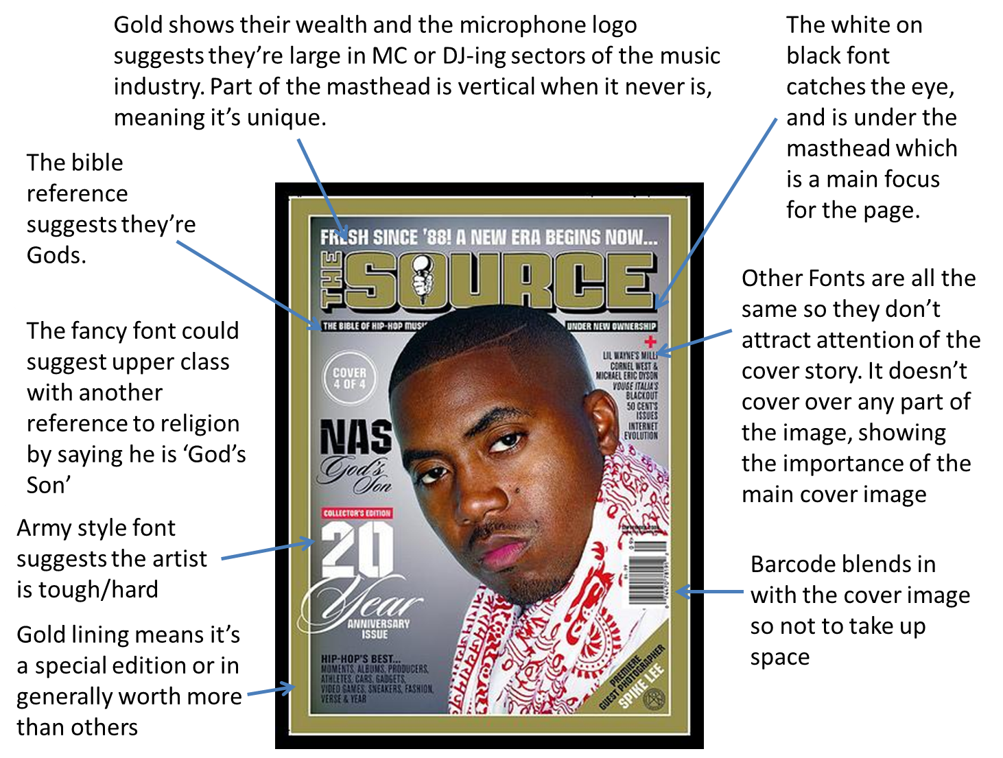
This is my analysis of a magazine front cover from the popular, hip-hop magazine 'The Source'. The analysis covers the key elements of a front page including the masthead, cover image and coverlines. It looks into the different colours used for the fonts and why, as well as the language and positioning of the features on the front page.
By Ollie

Here is my front page analysis. I chose this as it was closest to our genre/s of Punk and indie. It follows the same sort of layout for a front cover that we would like to use. As it is a well sort after and well known magazine, i decided to study it to see what exactly it is that attracts an audience. The large cover story title and image is the first thing a reader will see, and here it works. I will take this on board and apply it to my front cover.
By Hannah

Here is my double page spread analysis. To understand what elements of a double page spread that draw in an audience, I chose a magazine that is well known and with a band that is also quite well known, and that fits our genre of punk/indie. I studied it to see which parts particularly draw an audience in, for example the images that are used. Live images always attract an audience more than studio images. Also the colour scheme of black, red and white, quite plain, but also gives off a sense of suspicion and artistic.
by Hannah
Double Page Spread Analysis


This is my double page spread analysis from a popular music magazine. This covers most of the elements of a double page spread, including the photograph, language, title and design of the theme. The double page spread includes a large photograph of the band in the focus of the article, but only a small part of the article is featured to the right as it carries on to the next page, showing that the band image is more important. The band's name isn't written in big font but insead replaced by the photograph, meaning you should know the band just from their image.
By Ollie
Front page analysis
This is the front page of an issue of Kerrang Magazine. My front page analysis covers all the aspects that need to be examined. I have identified the skyline and heading, and why both are important to the overall style and look of the magazine. 'Kerrang' is a reasonably popular music magazine, and it is important to look into what aspects of the cover make them easily recognisable to the audience. The front cover shows a clear house style which helps my group to see what aspects we need in our own music magazine. I think I have sufficiently analysed the most important aspects of this magazine front page in order to help make an accurate front page of my own. From this, I have learnt that my magazine needs to have a strong mid shot image to engage my preferred audience and as my magazine will not be well known, the mast head should not be blocked or covered in any way.

By Maddy
Thursday, 27 January 2011


Here is my music magazine front cover and contents page. On the front cover I have used a large, poignent title, with an exclamation mark to emphasise the title and make it seem as though it is being shouted to an audience. The skyline is a competition entry, as this is one of the first things an audience reads, and helps to persuade a buyer as they have a chance to increase the value of their purchase. The list of bands down the cover line inform the read of the contents of the magazine, I used bands from the same genre as we are using in our magazine, quite popular and well known bands. The cover image is large and takes up most of the eyesight when first glancing at the magazine. The cover title is also large and easy on the eyes, a subtle green, and a quote from the band, which enhances the bands reliablity for being intervied by a magazine for the fans of the band, and also increases the reliability of the magazine. The lower part of the magazine also entails what to expect from the innards of the magazine. The house style is quite mellow and entising not loud and offputting.
Double page spread analysis

By Maddy
Wednesday, 26 January 2011
Interviews
These are members of the general public that are interested in the genre that we are researching for - rock (indie and punk). The answers to our interviews give us an insight into what we need to include in our magazine to make it successful. They also allow us to create a mock up of what should be included in our magazine to help us include all the different elements that are needed to give us a loyal audience. There are four interviews that show both sexes giving their opinions on how they enjoy their music which should give us some strong ideas to work with. As the audience is the most important principle to consider, these interviews are going to be a very valuable piece of research to help us achieve our aims. We have learned from this that although all our interviewees enjoy the same genre; they all have different preferences in their music and what they enjoy to read in a music magazine. Maddy organised which people to interview whilst Hannah filmed and Ollie questioned the interviewees. The questions were created between all three members.
By Ollie, Hannah and Maddy
By Ollie, Hannah and Maddy
Mood boards for the front pages and contents pages of music magazines is our genre
We designed two different mood boards - one for the front pages of music magazines that match our genre, and one for the contents pages of music magazines that match our genre. Most of the images are from the magazines: NME, Kerrang and Q. The mood boards are further research into our chosen 'rock' genre and give us an insight into the sort of house style we need to create in order to sell to our chosen audience. As you can see, most of the covers show dark backgrounds so that the artists are emphasized on the page. Often, the writing style is big, bold and bright for the main cover story so that the attention is drawn straight to it. I have learned from looking at other music magazines in our genre that layout is very important in how successful a magazine can be and what different house styles are on offer to match my genre.


By Maddy
Monday, 24 January 2011
Ollie's Premilinary Task


This is my Preliminary Task of a school/college magazine. This includes a front page and a mock-up of a contents page. The house style follows a simple colour scheme of a navy blue and golden yellow. This is the colour scheme used by the school that the magazine is based on. It includes a Masthead, Skyline, Coverlines and a barcode as well as a cover image.
By Ollie
Friday, 21 January 2011
Maddy's Preliminary


My preliminary is a magazine called 'The latest' and is for my sixth form college. I have tried to use realistic stories to make it look as real as possible. The front cover is a picture of my friend and follows the same house style throughout: the picture is dark and grungey, as is the main cover line. However, my other cover lines have been written in bright colours to make the cover look more interesting. It fits into a sort of emo genre, however it reaches out to the appropriate teenage audience as the picture is of a teenager and the random bright colours fit teenage interests as it uses many different colours. The picture fits an emo audience, but i used this as the majority of students at my college could be branded as 'emo' and so my magazine suits the majority audience at my college. I have tried to match the layout to the more popular magazines that you would see in your local magazine. The closer I matched the layout to a music magazine, the more it would help me to create my music magazine cover. However, doing this task has proved to me how difficult a professional looking magazine cover is to make and I know that I will have to work a lot harder in order to create a successful music magazine.
Monday, 17 January 2011
Punk Rock Mood Board
We made a mood board to illustrate a sub-genre of rock. This is helpful as it helps to concentrate on one area as rock can be classed as a very broad topic. This mood board shows pictures of just a few bands that are classed as 'punk rock' bands. The bands shown on this mood board are: Blink 182, Greenday, Sum 41, Hoobastanks, Foo Fighters, Lost Prophets, My Chemical Romance, Biffy Clyro and many more. All these bands give an idea of what genre our music magazine will be based on and what artists may be featured.
This mood board hints at the themes and house style that may be introduced into our music magazine. I have learned from this mood board what different styles we can look into in finding a house style for our magazine and what band's could be featured. Maddy wrote this information on the blog and chose a lot of the pictures.Hannah researched different bands that are classed as 'punk' so that they could be included in the mood board. Both members came up with popular band's they liked that could go on the mood board.

By Maddy and Hannah
This Mood Board illustrates another sub genre of rock - indie rock. This mood board gives us another option into what house style our music magazine may follow. Having a couple of different options available allows us to come up with a unique idea for our magazine. We could infact merge these two types of rock to come up woth a different sub genre - punk indie/indie punk. Having a mood board allows us to illustrate our idea's for design purposes so that we can have a clear idea of what style we would like to cover in our music magazine. The Wombats, The Verve and The Enemy are just a few bands featured in this mood board. We have learned from this what bands fit into the 'indie rock' genre and images that will help us to take our own photos for our magazine. Ollie found the photo's and Maddy named possible bands that fit the genre and wrote this information onto the blog.
 By Ollie and Maddy
Introduction
Hello, we are Maddy, Hannah and Ollie and this is our AS Media coursework. We are going to create a Music Magazine cover, contents page and double page spread for the project. We have chosen to base our Music magazine on rock genre. Our audience will be aimed at 16-23 year olds and we have researched into what our audience is interested in, how they come into contact with music and how much it influences them.
lots of love x
lots of love x
Subscribe to:
Posts (Atom)