Sunday 3 April 2011

Media Evaluation

We decided to film the evaluation of our media product as it would create a clearer understanding of our thoughts and feelings due to the fact that the audience/reader could see exactly what we were talking about, through gestures during the video. As a group, we discussed our thoughts on the finished product and put together an evaluation that discussed all our views. We attempted to address presentation by looking at the camera as we spoke, however it was very difficult to look at the camera and read the script at the same time. We could also have improved our videoed evaluation by zooming in on the screen and at us during certain parts of our speech for emphasis. Maddy wrote a lot of the evaluation, Ollie did a lot of the editing to piece the video together, and Hannah stood and watched and helped film it. We enjoyed working on this media product together and worked well as a team. We were happy with our finished product but it could have been improved.
By Maddy, Hannah and Ollie

Monday 28 March 2011

Double page spread


This is my double page spread. Trying to find a good image for this page was very difficult as it has to fit well on the page and match the article's description of the band. I am happy with my double page spread image as there are many levels which makes the shot look interesting. The body language is also at angles, making the shot look full of attitude, which appeals to my target audience. There is no running theme in outfit or style between the band members which creates the idea that anyone can relate to them. However, there is unity between the members as they are all girls and all wearing something black which links them to the target audience of 'emo's' or'goths' as these social groups are known to wear black. As the band are reasonably unknown, there band name is written above them in a large font so that it will draw audience attention after they have viewed the image. The name is written in a bright font because statistically, the brain recognises and enjoys bright colours over dull colours. The image fits well with my article collums, creating difference in length so as to make the page less equal and therefore more messy, appealing to my teenage audience.
However, the background of my page is all white, which is quite boring. Unfortunately, finding a background colour that would blend with the writing and the image is difficult to find.

Front page


This is my front page. It was a struggle to make it look proffesional. I used photoshop to edit my main image, then I moved thr file onto publisher to help create a good layout. I am happy with my front cover because all the information is readable and relevant. Also, my picture looks like it was not taken under studio lights, thus giving it a home-made finish. This helps to appeal to my intended audience as it makes the band look down to earth and natural. Plus, the image looks like a picture anyone could take, and thus the audience can relate to the image. I have kept up the house style using the same three colours: white, blue and red. These link to our union jack logo.
However, the front cover still lack the professional finish, something is missing. I have done the best with the programme software I had available and my own talent in using them. Although I am happy with the end result, I feel that it could be improved and the finished cover does not look exactly as I'd pictured it.
Making this front cover, I have learnt how using photoshop can give my images a finished look, and it can change the lighting subtly to create the atmosphere I wanted. I have also learnt how important the positioning of people in my images can be, and what certain body language can portray to create meaning.

By Maddy

Sunday 27 March 2011

Double Page Spread

This is my double page spread. It has the RIOT! house style in the top left corner with the masthead design and chosen font style to show the title of the page. The Band's Name is also in the same font and colour as it is on the Front Cover. The main picture has been cut and edited by raising the saturation and lightness, the same editing done to the top-right corner picture. The two pictures in the middle have been turned black and white with the exception of the hair. The lines inbetween the article follow the house style used on both the front cover and contents page. 

By Ollie

Thursday 24 March 2011

Second edition of Hannah's double page spread


Here is my second draft of my double page spread, I have used the right font now on the top left for the band title and included more fo the interview to make the page look more full, also i have moved the photos around to include the rest of the interview and just to see what it would look like if I moved them around. It still needs work, but im happier with this draft than I was with the first draft.
By Hannah Angwin

Monday 21 March 2011

Hannah's Mock up of contents page

This is my mock up of my contents page. Its got blue postman pat writing and looks just like Maddy's and Ollie's but from a different issue. Ive got sample images from the interview with Manic Poyo. And other images such as me in the top right from the peice about 'caught out images of 2010'.
By Hannah :)

Contents page


This is my contents page. I found it very difficult to make it look reasonably professional as many attempts looked amateurish. I like that the 'contents' is vertical and fills the side, I also like the fact that I have used both vertical and horizontal writing as it makes the page look more interesting. I think my contents page could still be improved as there is an element missing that makes it lack a real professional finish. However, my contents page is good because I have kept the house style the same, using the same font for the word 'contents' page as my mast head and using the same colours as the union jack.

By Maddy

Contents Mock-Up


This is my contents mock-up page. It has the same house style as the front page. The contents title is similar to the masthead as the title spreads from the Union Jack and then down the red banner, however it's positioned vertical unlike the masthead to show a variation. The font is the same font and colour as the front page and has the same red lines in between the different stories.

By Ollie

Thursday 17 March 2011

Hannah Double Page Spread

This is my mock up of my double page spread. I have used the band interview with my made up band on the right. On the left I have the photos we took for our practise shots. On the top left is a small fact file about the band aswell. The magazine title on the top right . On the top left I have the bands name to attract the desired audience, as it is on the front cover, sometimes a consumer will flick directly to the double page spread if it is their favourite band and so on, so an eye catching title and band name will direct the reader to what they want to read first.
By Hannah :)

Front Page Mock-Up


This is my mock-up of the front page design. The house style is similar used by the other members of my group. I used the new masthead design with the red background as the white looked like it was split from the masthead. The colours used in the skyline are the same used in the flag, linking it to its patriotic roots. The blue colour of the font used for the coverlines is also the same used in the flag. The fact that the cover story title is in orange seperates it from the coverlines, making it different and stands out. The positioning of the barcode and price is similar to the other issues.

By Ollie

Thursday 10 March 2011

This is my front cover for our magazine. I have used the new masthead design for mine. I feel the use of colour on the front cover highlights the british aspect to it well, e.g the idea of anarchy. I feel the topics and contents of the magazine I have chosen to place on the front cover reflect our chosen genre well. The use of the gaming on the right apeals to teenagers. The humour aspect with my photo in the top left, having 'caught out' as a tag line for funny photos taken during 2010. The simple title for the cover story of 'they're back' I feel is effective, as it is straight to the point and tells the reader exactly why they are in this months issue. The use of popular and well known bands along the skyline attracts the reader. It is clear it is a music magazine as I have used two bands on it. I have included the bar code on the bottom right with the price and date of issue aswell. Overall i feel my front cover has followed the required genre and house style.  By Hannah :)

Monday 7 March 2011

New Masthead Design


This is our new Masthead design. We decided to change it as the right hand side was white, and it made it look unfinished. We also used the Liquify tool in Adobe Photoshop to merge the centre of the of the image so that there is not too much of a difference between the change from picture to blank colour. We chose to use the red of the flag instead of the blue as the red is more vibrant and eye-catching. The font also stood out more on the red than with the blue. Also, the connotations of the colour red express anger, love and danger which could suggest that the magazine can offer these emotions and opportunities to the readers.

By Ollie, Maddy and Hannah

Draft of Double Page Spread Interview

Double Page Spread Article
Band Name: Ginger of Instrument
Genre: Indie Rock
Years Active: 2008 - Present
Origin: Wymondham
Band Members: Chuck Boris, Lindsay Cohan, Geri Shalliwell
Interview
Riot recently caught up with the latest indie sensation, Ginger of Instrument. The band includes the three founding members: Chuck Boris on drums, Lindsay Cohan on Bass and Geri Shalliwell as guitarists/vocals, and as the name lets on the three band members all have the same hair colour… one guess which colour that may be. This triangle of redheads sliced through the charts with their newest single ‘Ginger Rain’, reaching number 3 in the charts. With their new found success, they decided to make time in their busy schedule for an interview with an enthusiastic Riot. Here’s how it went….
Riot: Welcome to the Riot headquarters boy and girls. Like what you see?
Chuck: It could do with a bit of decoration.
Riot: Cheers. Before we talk about your new single, let’s get a bit of background information, How’d you trio meet?
Lindsay: We all went to the same college in our local town of Melton Mowbray, it wasn’t the best place to study at
Geri: (Chuckles) We all met in a Graphics class, me and Geri came out from jamming in the music department, which was right next to the graphics. As we walked into the class, Chuck turned on the charms and started talking to us. He had heard us jamming and told us he liked what we played. Funnily enough it worked and the rest as they say is history.
Riot: So you were a bit of a player then Chuck?
Chuck: Well once we became friends it died down a little, the jams became more frequent and things moved on.
Riot: In what way?
Chuck: We became a band without becoming a band basically.
Geri: As we jammed more and more we were becoming a band however never brought up the topic of taking anything seriously
Lindsay: That was until we got our first gig…

Riot: This sounds interesting. How did you come across the first gig?
Geri: Our friend heard us jamming, and as his old man owned a pub in a village next to ours, told us he would ask him if we could play there.
Riot: And?
Chuck: We rocked the house!
Lindsay: (Laughing) It was the best first gig ever! Saturday night in a country pub, filled with heavy drinkers.
Chuck: It became a frequent thing, almost once every month
Riot: Did this help you build a fan base?
Geri: It helped quite a lot actually. As the crowd got bigger, other pubs became increasingly jealous and started to book us for gigs in various towns and villages. We were driving around the county every weekend. Our name was soon known in every town and even in the city of Leicester in various parts.
Riot: So a story of world domination then? One of these gigs included the meeting of the respected band manager Charlie Perriam didn’t it?
Chuck: I shall ignore the world domination joke. But indeed this is where we met out manager, Charlie. He was in town with another client, having drinks in the bar next to the one we were playing in, we were that loud that they came next door to check us out...
Geri: (interrupting) … and he loved us! He came backstage and spoke to us about having time in a proper studio. He especially loved the song Ginger Rain, it became our closing song as it was that upbeat that the whole audience would go crazy dancing.
Riot: And now we come to the single, So Ginger Rain was a popular song before it was released as a single?
Lindsay: It was very popular around the local village and town as we had recorded a small EP in the studio at college. We began handing them out at the small local gigs. It took a while for the single to grow on people in Leicester but it eventually got there.
Riot: And what happened with the recording session with Mr Perriam?
Geri: We re-recorded the EP as well as some new material. Charlie was very enthusiastic about every song. We spent a lot of time in the studio perfecting our sound.
Chuck: It was a little while later that we heard from Charlie again. Then out of the blue he rang us and told us to listen to one of the DJ’s shows on Radio 1. We were huddled around a radio in my lounge waiting and waiting, until Ginger Rain was introduced as the next track. Before the first verse was over we were on the phone with Charlie again, talking about playing at a local festival that had small media coverage for the radio. Next thing we know we were in the line-up.


Riot: How long did this whole period of making a name for yourselves last?
Geri: About 2 years I think?
Lindsay: Roughly that. Once we played at that festival it all kicked off. We ended up touring small venues around the country once we had finished our studies. It was becoming so surreal for us that we were playing a gig and then moving on to the next venue and doing the same again every other day. It was just like you hear with these big popular bands only smaller.
Riot: Back to the single now… it’s currently 3rd in the charts, how do you feel about that?
Lindsay: Over the moon! It’s great to have your work recognised and shows how much your music is listened to.
Chuck: We got a call from Charlie whilst at a family thing, everyone was so happy for us.
Riot: It seems like you’re all on cloud nine right now, what’s coming up in your schedule?
Geri: We’ve still got a few more dates on our small tour
Chuck: After that it’s back into the studio to work on our debut album, then its straight back on tour to support its release.
Riot: Sounds like you’ve not got a lot of time to rest then?
Lindsay: I suppose we haven’t but as it’s what we’ve been planning for it doesn’t really bother us too much.
Riot: Well I’m afraid our times up for today. It’s been great to talk to you and we hope that everything goes well for your debut album.

Ginger Of Instrument’s first EP, Ginger Rain, was released on February 17th and currently ranking 3rd in the UK Top 40 charts. Their debut album is expected to be released mid- May with a following European tour.

By Ollie

Thursday 3 March 2011

First attempt at a magazine front cover

This is a first attempt at a magazine front cover, the image is not the one I wish to use as it doesn't really match the house style or genre, and the lighting would need to be darker. Plus, the image should be closer to a mid-shot. However, from setting this out, I have learnt that the 'RIOT!' masthead needs to be edited as the white half looks unfinished. However, the layout is set how I would like it to be: the barcode, masthead and skyline are fine. However, I might want to better structure the cover lines. Although, it could be argued that the random layout of the cover lines matches the audience and how they would set out something. It also matches the anarchy idea that our house style is based on.


By Maddy

Planning for my photo's


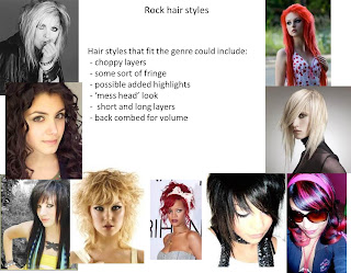
These 3 slides show my planning on the image I want my band to have. The clothes and hairstyle need to fit the house style of the magazine and the genre of punk rock. These slides have helped me to find other artists that will have a similar style to the one I want my band to have. It also shows popular females of the past, so I can see who has been popular in the past and who has not. From this, I have learnt that there are more popular female punk rock artists than I originally thought, showing my band idea would have a slot in the music industry.
By Maddy

Masthead Design


This is our masthead design for our music magazine, Riot. The union jack and title of Riot suggests the theme of anarchy. The font has the look of an old-school, homemade DIY effect that relates to the punk genre. The faded union jack also creates the feeling of being British, however with a lack of patriotism. It is also a young font and aims more towards a teeneage market. There are also not many British-made magazines and the fact that the Union Jack is included in the masthead suggests it is the best British-made magazine.
By Ollie, Maddy and Hannah

Monday 28 February 2011

Sample shots


These four pictures where rough attempts at using the camera to portray different effects. We wanted to show different positions and levels for the people in them to experiment positions for our band member photos. Ollie and Maddy edited the photos on photoshop. Hannah and Maddy took the photos and positioned the people in them. Maddy uploaded the pictures onto the blog and wrote this analysis.
These images have helped us to learn what positions work well and which don't. We also learnt that all our images need to be taken using a tripod to stop the camera shaking and the images from blurring. When we take the band images, we will need to use a tripod. These images have been manipulated to show our editing skills, the lighting and shade has been changed to make the pictures look purer.

By Maddy and Hannah

Thursday 17 February 2011

Hannah double page spread.

This is my double page spread. I drew it with a pencil.
I promise I wrote more, but this stupid blog deleted it.
By Hannah

Double page spread, rough layout

This is a rough drawing to show my main ideas for my double page spread layout. As the band is not well known, I want to make the image bigger to draw in the reader's attention. The Band name also needs to be written in a large font on the spread as reader's may not know them, and so their name will also attract attention to the band and help build an interest. The image of the girls needs to be the most emphasized point as it will interest readers the most so the background behind the girls needs to be slightly out of focus in order to make the girls the emphasis. I want to try and match the background colours to the house style as well as the band, so I'm choosing to use red, yellow and orange as background colours mixed with black and grey. The yellow, red and orange are to represent fire which links to the name 'Haze', they will also be out of focus in order to represent 'Haze' more clearly. The article will fill the opposite page, and I will include quote boxes to emphasize imortant information. I want the girls to be positioned with different levels to make the image look more interesting. A group shot will be the most effective way to show all the members reasonably equally.


By Maddy

Monday 14 February 2011

Layout

Our layout is going to be straight forward and simple. The skyline will be at the top of the page, advertsing comptetitions and merchandise only. Then the mast head will run from spine to trim, spelling 'RIOT!' with a union jack behind the 'R'.  Underneath this will be a mid-shot to match the main story of the issue. Beneath or to the side of the image will be a bar advertising some of the other cover lines in the issue. The barcode will be placed in the bottom right corner, as it is the least important part of the magazine according to the audience's interest. The issue date will be written underneath the mast head, in a small font, as it needs to be shown but is not massively important at first glance.

The image below shows a rough outline of the type of layout we will aim to achieve.

By Maddy


These two designs show two possible layout choices for our magazine. The mast head design is different on both to show two desgin choices that we have. Plus, the placement of the cover lines and other images are different to show options for design. As a group, we decided that the design with the picture of the girls is our favourite due to the style of mast head. The word 'RIOT!' is in a slanted and disorganised style that matches our genre. Plus, the design of the union jack looks better being placed behind the 'R' only as it keeps it's square place. Also, it creates contrast between the word, making it emphasized. However, both these designs are still only rough guidelines as to the design we finally create.


By Maddy

Band interview

Band interview
Name:  Manic Poyo
Genre: Punk Rock
Origin: Dumfries, Scotland
Years active: 1997-present
Biggest influences: Blink 182, Lostprophets, The Ramones, Biffy Clyro
Active members: Harvey Pleb, Pete Tractor, Joan Lamone and Travis Park
Hey guys, so you’ve made a recent explosive comeback, how’s the big reunion tour going for you?
Harvey (drums) : Well so far we’ve played 4 gigs and we’ve had a pretty big turnout, at least 600 – 1000 per night. The venues we’re playing are pretty great, not quite arena but still pretty amazing.
Pete (lead vocals): Yeah I mean, we finished our last tour in 2001, and by then we were playing pretty big venues and arena, but the smaller venues allow you to interact more with the fans.
Good, well what about the fans? Are they a good welcome back?
Joan (Bass): Yeah they’ve been pretty amazing they’re all loud and really lively, pretty much how we left them back in ’01.
Are you playing all your original stuff or have you written new material?
Travis (Lead guitar): Well we’ve written a few new things, but we’re not releasing them or even talking about them until revealing them at the shows and our album later on this year.
Pete: Well we know that most of the fans are there for our original stuff, that’s how they know who we are. I know I hate it when I got to a gig and they play new stuff that we don’t know it and cant join in.
How has the comeback affected your lives?
Harvey: Well of course we’ve all grown up a bit now, gotten more serious in our lives, in our music and got families and girlfriends.
Pete: I’ve got two kids now, I got married, Harvey you’ve got one on the way, and Travis is engaged, just.
Joan: Apart from me, I’m still single *laughs*.  No desire to be in a relationship. The band. That’s what’s important.
Pete: Yeah, right, good one! *all laugh*


Wow, so errm, serious? *all laugh* Does that mean we can expect great things from you guys then? How long will you be around for now?
Harvey: Well we’ll give up when people get tired of us *laughs*, we only gave up last time because we had a fall out. But like we said, we’ve grown up now and we’re back as adults. We were so naive and childish back then.
Joan: Yeah I think ‘H’ has got it pretty much covered there. We’re back now, and we’ll go when we’re not wanted anymore, but judging by gig ticket sales, that’s not for a while. *laughs*
Anything to say to the fans about your new tour?
Travis: It’s pretty electric and outgoing, all lively and shit, sort of a ‘we’re back, we’re explosive and we mean business’.
Pete: Yeah, you’ll enjoy the hell out of it, great value for money, we’ve got some amazing supports coming your way, like YM@6, some We the kings in there too, we’re prepared man *laughs*.
Joan: BRING IT ON!
*All laugh*
Whats your favourite things you like to order on the rider?
All but Travis: Jelly cubes!
Travis: Urghh…
Why? Do you not like jelly cubes?
Travis: NO! This lot insist on it, but its disgusting, and not to mention really bad for you.
Joan: Mr ‘Healthy’.
Travis: Nah, I just prefer something heartier, like pie. A nice beef pie.
On the rider?
Travis: Yes *laughs*
We’ve got a few questions here from your fans:
Greg north (Hunstanton)
‘Have you guys got any favourite albums that you would recommend listening to?
Travis: Dirt – kids in glass houses , I know it’s all pop like at times, but there’s some really good tunes on there, ‘Youngblood’ in particular, just upbeat, good lyrics, one of my faves from last year.
Pete: System of a down – Toxicity, purely because we’ve met them and they said they loved ours *laughs* Nah, it’s an awesome album and they’re cool guys. ‘Chop Suey’ A classic, everyone knows It, but to those who have never even heard of this band, shame. On. You.

Harvey: Enema of state – Blink 182 .Best band ever, amazing music, I mean I just chose this album because it’s the first one I thought of, but all of their albums, just, genius.
Joan: I don’t have one, not really into music that much to be honest *laughs*….Well my taste is a lot heavier to these lot, I mean kids in glass houses? What!? I agree with Blink, but SOAD…..Nah I don’t know, I like tracks rather than bands.
Okay and just one more here:
Georgia Yeovil (Dumfries)
When on tour, are you going to do any meet and greets? Id love to meet you guys, I think your awesome.
Harvey: We’d really love to do that actually, we’ve talked about it in the past, and have done a few, but in the end, its where and when to do them is the problem.
Travis: I’m going to act like a geek here and say, I met kids in glass houses at a meet and greet earlier last year. It was a great experience, so if we’ve got fans of our own who want us to do stuff like that we will *smiles*.
Well that’s all we’ve got for you today, thank you all very much indeed for this, im sure your fans reading this will enjoy it
All: yeeaahhh!! *clap*
Manic Poyo’s new album ‘Ground to the sky’ Is released in June and their tour will commence until December, go to our website www.wix.com/omg_lloyd/manicpoyo  for tour dates, competitions and more!


 By Hannah :)

Rough draft of article

Interview for double page spread
RIOT! caught up with new up and coming band Haze to find out what makes them tick, and why their music seems to be raging up through the charts, leading them up to a whole new world of opportunity and  popularity. Their latest single came fifth on Radio 1’s top 40 and we talk to the members about the album they will be releasing next month.
What you need to know about Haze (if you don’t already!)
Haze comprises of four members: Amber (lead singer), Grace (keyboard), Jessie (guitarist) and Soph (Drummer), the hottest new girl rock band. Their ages range from 17, Amber, to 20, Soph. The girls have been seen touring, including small gigs in Birmingham and Nottingham.  However, after getting signed by Sony Music Entertainment, the girls have rocketed into the main stream charts.  In the weeks that followed the girls released three singles, all placing in the top 40. With their new album on the way the girls have been spotted around London, in some of the top A-list hot spots, proving that their time is coming.  Before long they’ll be grabbing the number 1 spot.  It’s not surprising that they’re shooting up the celebrity ladder since a new, all girl, rock band has been in demand for a long time.
RIOT! was lucky enough to grab an interview before the girls became swamped with offers.  This is how it went…
RIOT!: Where did you guys meet?
Amber: Well, Grace and I went to school together. Jessie joined us after we met at a different band audition and decided to create our own band. We found Soph at our first small gig, she introduced herself and we clicked straight away. So, we invited her to join us.
Jessie: The four of us have become the best of friends and been together ever since.
RIOT!: How long did it take you to get you first real gig?
Soph: Well, after a Jam session at my College, the Head came in and asked us if we wanted to perform in our end of year assembly. Then Paul, the father of one of my mates, came forward and asked us if we wanted to perform at his club in Nottingham. Things have sort of spiralled since then.
RIOT!: How did it feel when the manager of Sony Music Entertainment asked you to join their label?
Grace: Well, at first we were in total shock, obviously. But we started talking about and realised we would be mad not to accept the offer.
Soph: To be honest, there was a bit of hesitation because you pick up such horror stories about major labels, but we created a mock-up of a contract and realised that most of the stories we’d heard were rumours.
Jessie: We are really grateful to get the opportunity. If it weren’t for Sony, we’d still be touring around the pubs where the audience couldn’t care less.
RIOT!: It sounds like you have a bit of a fairy tale lifestyle going on right now.
Amber: Yeah I guess we have been really lucky. I just hope our luck doesn’t run out too soon.
RIOT!: So, you’re all really beautiful young girls and I’m pretty sure everyone has noticed. Do you have any lads in your sights?
Grace: Well, actually, I already have a boyfriend…but if I could choose a celebrity, it would have to be Jared Leto. (Nervous laughter)
Jessie: I wouldn’t want to spread any rumours but I’m pretty sure Amber has already had a few offers… (Smirking)
Amber: (with fake surprise) I have no idea what you talking about! (Laughing) but since RIOT! is my favourite magazine, I guess I could spill the beans that I was asked for my number by Nick Jonas.
RIOT!: Well, although we at RIOT! are not a fan of the genre, I really hope you gave it to him
Amber: Erm… yea and he may have asked me for a date next Wednesday (winks)
RIOT!: It sounds like you girls have got it all! Thanks for coming in to talk to us.
Soph: No problem, RIOT! is our favourite magazine and you can always have an article with us.

Well there you go readers, the latest exclusive with Haze. It would be advisable to keep a close eye on these girls as they travel along the fast track to success. Just remember, you heard it here first!

Quote boxes:  RIOT! is our favourite magazine.   If it weren’t for Sony, we’d still be touring around the pubs.

By Maddy

Thursday 10 February 2011

Mast head

We have decided to call our magazine 'RIOT!' This is because it links to our genre of Indie/punk rock as many music video's of the genre feature fighting and destruction. Plus, at concents and gigs of our genre, people get involved in 'mosh pits' when listening to the music which involves pushing and shoving each other, which in a suburban setting would be classed as 'rioting'. Riot is a word that also links to the idea of anarchy which links to the style of our magazine and our preferred audience. The exclamation mark on the end creates the idea that the name is being shouted, which again links to the style of the magazine and the idea of anarchy.

The Mast head font will read from spine to trim, however the font will be messy, and some of the letters should be tilted in either direction to create the idea that this magazine is not straight edge. The background of the mast head, behind the font is going to be a union jack. However, it is going to be smudged, as if by a hand print, to lead away from the idea of patriotism and more about breaking the rules.

This image gives an idea of what sort of union jack ours will look like on our magazine.

By Maddy

Skylines

The Skyline is very important on a magazine because the skyline and masthead is usually the only thing a member of the public can see when the magazine is on the shelf. For our magazine, we are going to use the skyline to advertise merchandise and competitions. This is because people are often intrigued about the idea of 'freebies' and the idea of winning tickets for gigs or free CD's simply by buying the magazine should help to draw in a strong readership. The format of our skyline will simply run across the very top of the magazine from spine to trim. Most likely, our skyline will be written in a bold, black font so it is easy to read and clear so that people will notice it straight away. This will be the same in every edition to keep the house style constant. Two examples of skylines that we could use are: ' Win tickets to see Lost Prophets live on tour!' or 'Discount off Blink 182's latest album inside this issue!'

By Maddy

Monday 31 January 2011

Double page spread analysis

This is a second double page spread analysis that looks at the different language people use in articles and how it can relate to a bands image. With both double page spread analysis', I think I have covered all the important aspects of a double page spread including: image, font, language and the connotations of each. From this analysis of a double page spread, I have learned abuout how important language and font can be in an article to show a band's image and thus, for my own magazine, I shall think carefully about what language I use so that it matches my band's image and magazine house style.

By Maddy

Front Page Analysis


This is my analysis of a magazine front cover from the popular, hip-hop magazine 'The Source'. The analysis covers the key elements of a front page including the masthead, cover image and coverlines. It looks into the different colours used for the fonts and why, as well as the language and positioning of the features on the front page.

By Ollie
Here is my front page analysis. I chose this as it was closest to our genre/s of Punk and indie. It follows the same sort of layout for a front cover that we would like to use. As it is a well sort after and well known magazine, i decided to study it to see what exactly it is that attracts an audience. The large cover story title and image is the first thing a reader will see, and here it works. I will take this on board and apply it to my front cover.
By Hannah
Here is my double page spread analysis. To understand what elements of a double page spread that draw in an audience, I chose a magazine that is well known and with a band that is also quite well known, and that fits our genre of punk/indie. I studied it to see which parts particularly draw an audience in, for example the images that are used. Live images always attract an audience more than studio images. Also the colour scheme of black, red and white, quite plain, but also gives off a sense of suspicion and artistic.
 by Hannah

Double Page Spread Analysis


This is my double page spread analysis from a popular music magazine. This covers most of the elements of a double page spread, including the photograph, language, title and design of the theme. The double page spread includes a large photograph of the band in the focus of the article, but only a small part of the article is featured to the right as it carries on to the next page, showing that the band image is more important. The band's name isn't written in big font but insead replaced by the photograph, meaning you should know the band just from their image.

By Ollie

Front page analysis

This is the front page of an issue of Kerrang Magazine. My front page analysis covers all the aspects that need to be examined. I have identified the skyline and heading, and why both are important to the overall style and look of the magazine. 'Kerrang' is a reasonably popular music magazine, and it is important to look into what aspects of the cover make them easily recognisable to the audience. The front cover shows a clear house style which helps my group to see what aspects we need in our own music magazine. I think I have sufficiently analysed the most important aspects of this magazine front page in order to help make an accurate front page of my own. From this, I have learnt that my magazine needs to have a strong mid shot image to engage my preferred audience and as my magazine will not be well known, the mast head should not be blocked or covered in any way.


By Maddy


Thursday 27 January 2011


Here is my music magazine front cover and contents page. On the front cover I have used a large, poignent title, with an exclamation mark to emphasise the title and make it seem as though it is being shouted to an audience. The skyline is a competition entry, as this is one of the first things an audience reads, and helps to persuade a buyer as they have a chance to increase the value of their purchase. The list of bands down the cover line inform the read of the contents of the magazine, I used bands from the same genre as we are using in our magazine, quite popular and well known bands. The cover image is large and takes up most of the eyesight when first glancing at the magazine. The cover title is also large and easy on the eyes, a subtle green, and a quote from the band, which enhances the bands reliablity for being intervied by a magazine for the fans of the band, and also increases the reliability of the magazine. The lower part of the magazine also entails what to expect from the innards of the magazine. The house style is quite mellow and entising not loud and offputting.
By Hannah :)

Double page spread analysis


The double page spread analyses some of the elements to this article. Not all have been mentioned as there is simply too many things to discuss. However, this article is a good choice because the artists has recently become very popular, and the title of the article 'USA got the love' illustrates this. A few years ago, the artist and her band were seen as a new band at the 'Brit Awards'. This article shows your typical article from of a popular artist as the picture is very large, and the main focus, showing that she is easily recognisable from  a simple image. Plus, the band name is not even mentioned, showing that they are very well-known. I have learned the importance of layout on a double page spread to highlight certain aspects in order of importance. Plus, I have learned what different connotations can mean in order to get a certain view point across.


By Maddy

Wednesday 26 January 2011

Interviews

These are members of the general public that are interested in the genre that we are researching for - rock (indie and punk). The answers to our interviews give us an insight into what we need to include in our magazine to make it successful. They also allow us to create a mock up of what should be included in our magazine to help us include all the different elements that are needed to give us a loyal audience. There are four interviews that show both sexes giving their opinions on how they enjoy their music which should give us some strong ideas to work with. As the audience is the most important principle to consider, these interviews are going to be a very valuable piece of research to help us achieve our aims. We have learned from this that although all our interviewees enjoy the same genre; they all have different preferences in their music and what they enjoy to read in a music magazine. Maddy organised which people to interview whilst Hannah filmed and Ollie questioned the interviewees. The questions were created between all three members.


By Ollie, Hannah and Maddy

Mood boards for the front pages and contents pages of music magazines is our genre

We designed two different mood boards - one for the front pages of music magazines that match our genre, and one for the contents pages of music magazines that match our genre. Most of the images are from the magazines: NME, Kerrang and Q. The mood boards are further research into our chosen 'rock' genre and give us an insight into the sort of house style we need to create in order to sell to our chosen audience. As you can see, most of the covers show dark backgrounds so that the artists are emphasized on the page. Often, the writing style is big, bold and bright for the main cover story so that the attention is drawn straight to it. I have learned from looking at other music magazines in our genre that layout is very important in how successful a magazine can be and what different house styles are on offer to match my genre.


By Maddy


Monday 24 January 2011

Ollie's Premilinary Task

This is my Preliminary Task of a school/college magazine. This includes a front page and a mock-up of a contents page. The house style follows a simple colour scheme of a navy blue and golden yellow. This is the colour scheme used by the school that the magazine is based on. It includes a Masthead, Skyline, Coverlines and a barcode as well as a cover image. 
By Ollie

Friday 21 January 2011

Maddy's Preliminary

My preliminary is a magazine called 'The latest' and is for my sixth form college. I have tried to use realistic stories to make it look as real as possible. The front cover is a picture of my friend and follows the same house style throughout: the picture is dark and grungey, as is the main cover line. However, my other cover lines have been written in bright colours to make the cover look more interesting. It fits into a sort of emo genre, however it reaches out to the appropriate teenage audience as the picture is of a teenager and the random bright colours fit teenage interests as it uses many different colours. The picture fits an emo audience, but i used this as the majority of students at my college could be branded as 'emo' and so my magazine suits the majority audience at my college. I have tried to match the layout to the more popular magazines that you would see in your local magazine. The closer I matched the layout to a music magazine, the more it would help me to create my music magazine cover. However, doing this task has proved to me how difficult a professional looking magazine cover is to make and I know that I will have to work a lot harder in order to create a successful music magazine.